The next time you log into your AWeber account, you may notice that the message editor has changed. All the same functionality is there, but it has moved out of your way so you can get down to writing your emails without distractions.
What’s new?
Element navigation on the side
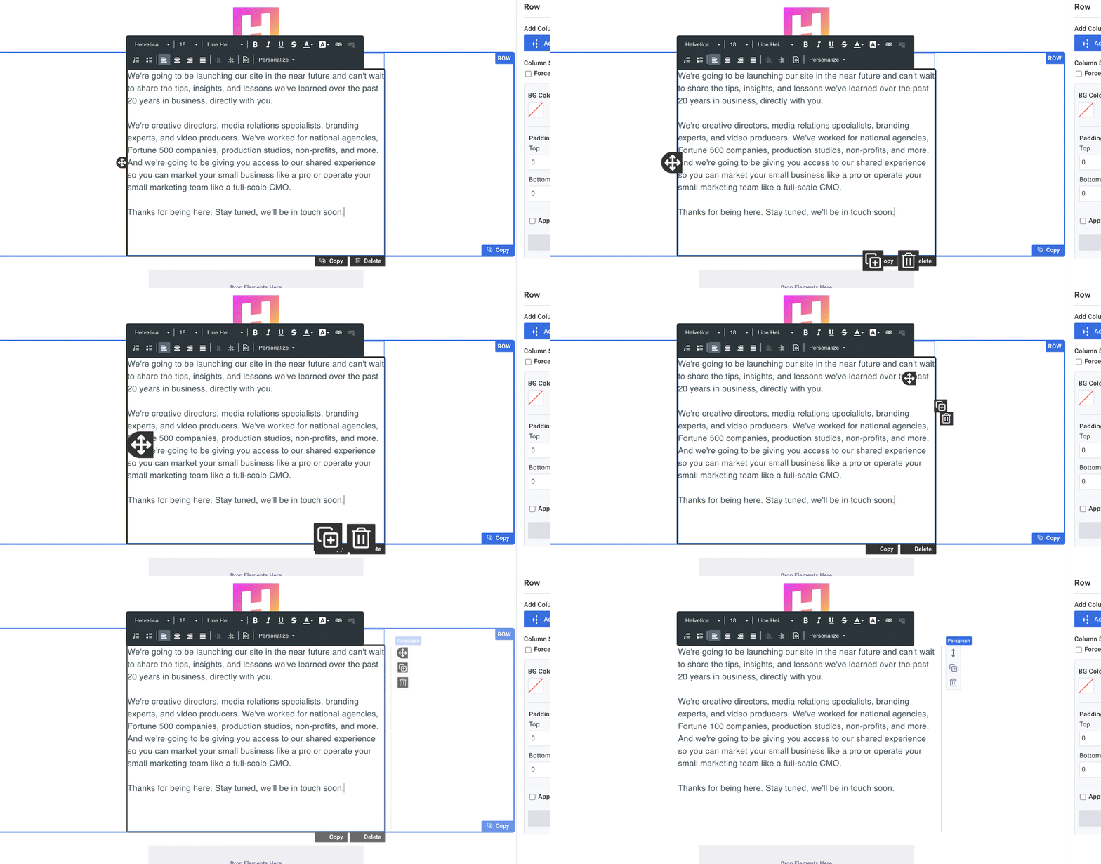
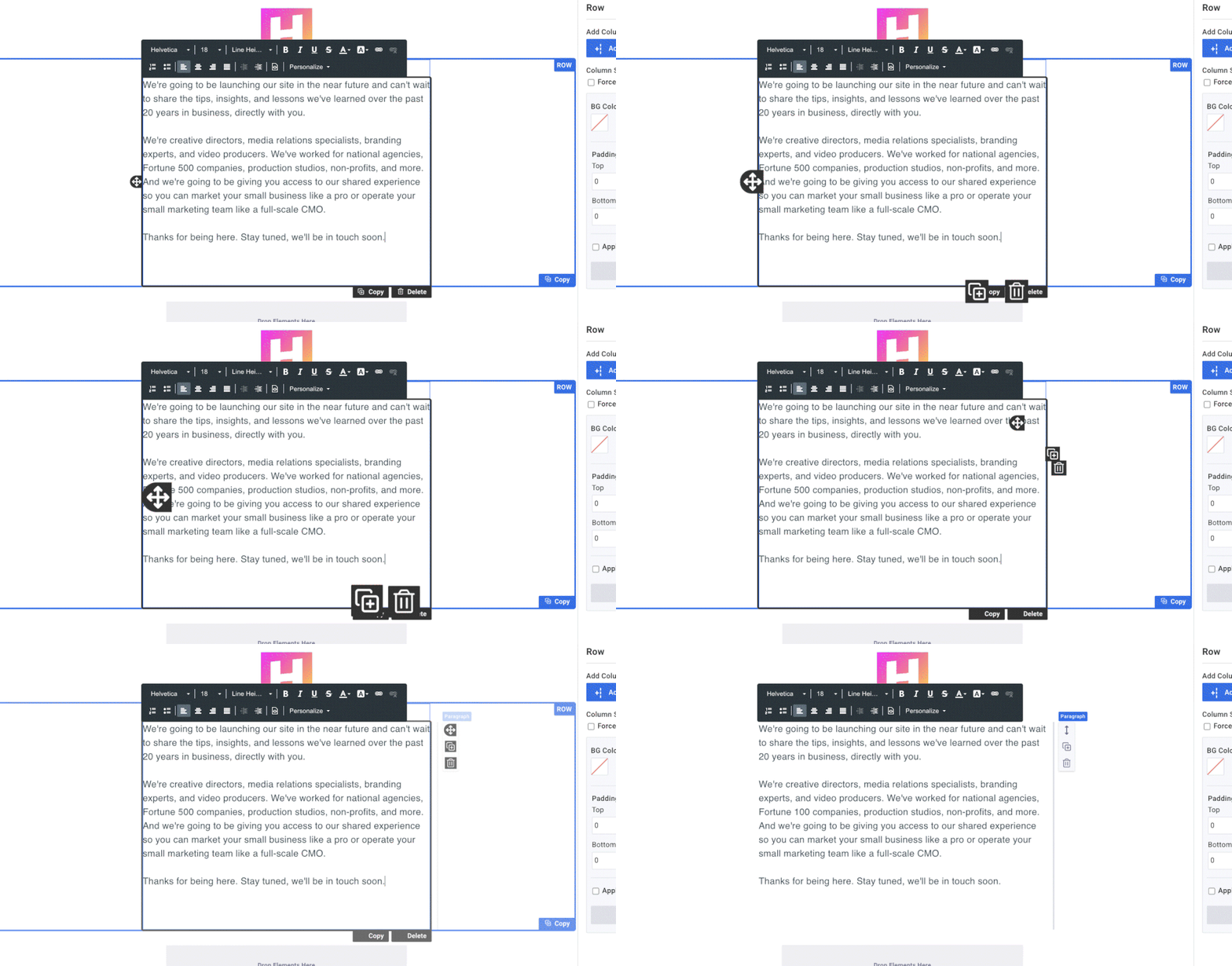
The “move,” “copy,” and “delete” buttons are in a new place.

You’ll no longer see blue and black boxes surrounding the row / element you’re working on. Instead, you’ll see a light gray line on the right side of your element. The row will have a light blue box surrounding it only if you are directly working on that particular row.
In the new version, you have to hover over the section to see the move, copy, and delete options.
Check out what changed:
Before

After

With fewer visual distractions, you can get your next email sent faster than ever.
Headers in the paragraph element
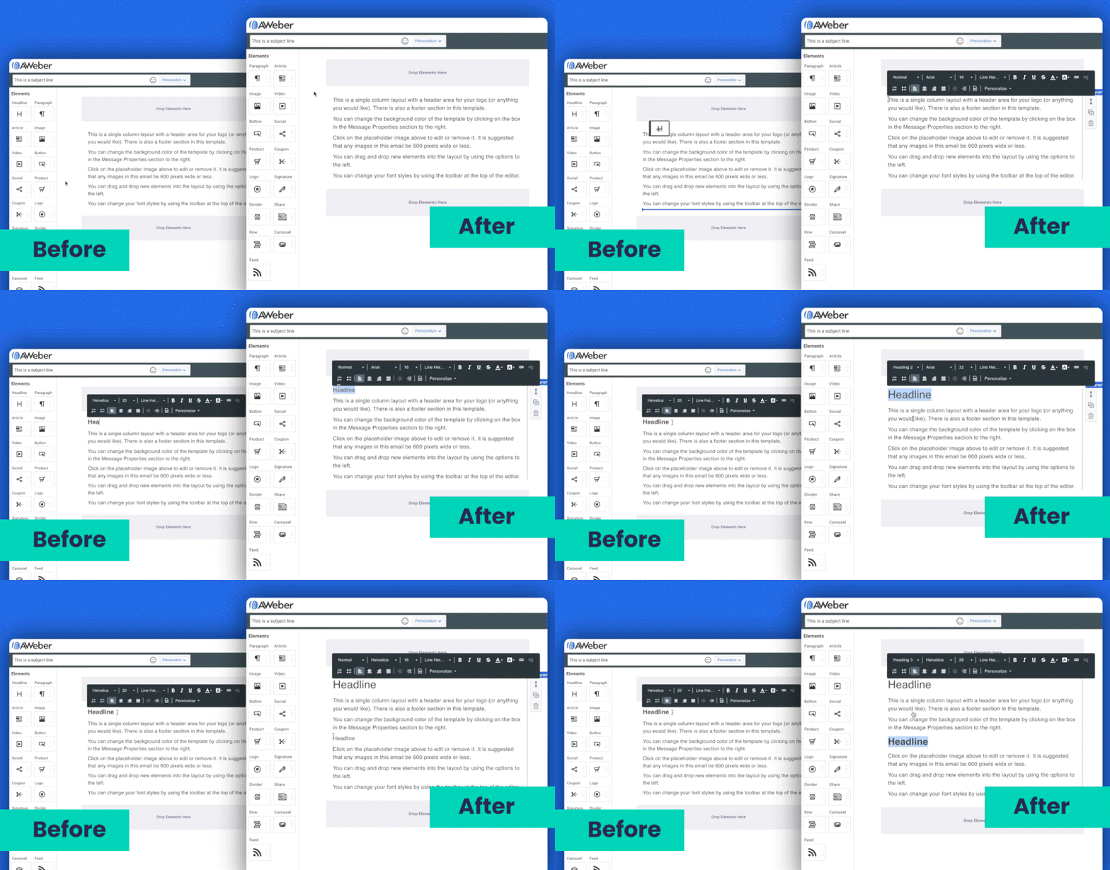
We’ve combined the Header and Paragraph elements so you can now create headers directly within the paragraph element.
Check out what changed:

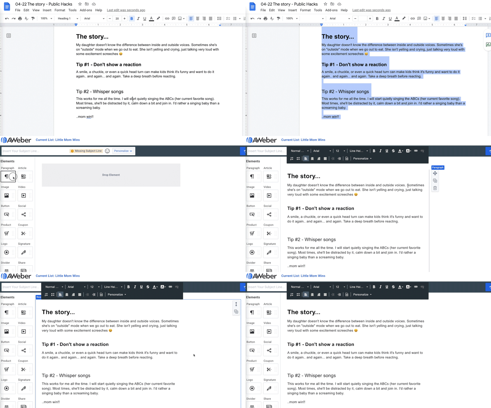
Copy-and-paste from a separate document in seconds
Do you draft your emails in Google Docs? Microsoft Word? Apple Pages? Somewhere else? It’s extremely easy to copy those email drafts and paste them directly into the AWeber message editor.

Try out the message editor today — updates included — and let us know what you think in the comments section below👇.
The post A Fresh New Look for the Message Editor appeared first on AWeber.
Article link

